Choosing the Right Font
Fonts fall into six main categories. There is no one "best" type of font. Rather, each type serves different purposes.

There are six different categories of fonts:
- Serif: those that have "serifs," the little curved bits at the ends of letters
- Sans Serif: literally, "without serif," these fonts are straight without the little curved bits
- Monospace: those fonts where every letter takes up the same amount of space
- Dingbat: fonts that have symbols in place of letters and numbers
- Handwritten: fonts that are meant to appear hand-written by deliberately introducing inconsistency among the characters
- Script: "cursive" fonts where the letters are connected to each other
There is no one "best" type of font.
Rather, each type is best suited for different purposes.
When to Use Each Type of Font
Here are a few simple rules you can follow to boost the visual appeal of your forms and reports.
Serif
Serif fonts work best for:
- Long passages of text: the serifs visually join the letters making it easier for our brains to group them together into words; this is why every printed newspaper uses serif fonts for their article text
- Laser-printed text: laser printers take best advantage of the fact that fonts are vector-based, so the fine curves of the serifs appear smooth and crisp on the printed page
- Read-only memo fields: for example, narrative-style notes fields that regularly exceed 255 characters displayed in a locked text box
Sans Serif
Sans serif fonts work best for:
- Headlines: the lack of serifs make them appear visually distinct from the rest of the text
- Computer monitors: modern operating systems perform anti-aliased font smoothing by default, but sans serif fonts still appear relatively crisper than serif fonts when shown on screen
- Field labels: sans serif fonts are ideal for field labels because they take up relatively little room while still being easy to read on-screen
- Report data: I use sans serif fonts almost exclusively for my data-centric Access reports (the only reports where I use serif fonts are those with long passages of text, such as form letters)
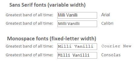
Monospace
Monospace fonts work best for:
- Writing code: my personal favorite for this task is Consolas, as it has a strong visual distinction between one and lower-case el and between zero and upper-case o
- User-editable text: while monospace fonts take up a lot more horizontal screen real estate, they are also a lot easier for users to edit; trying to correctly position a mouse cursor to select an "l" in between two "i"'s is difficult to do with a variable width font; I call this the Milli Vanilli test
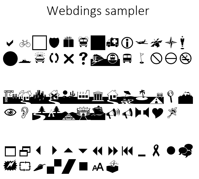
Dingbat
Dingbat fonts, like Webdings or Wingdings, work best for:
- Map annotations: to mark points of interest
- Special effects: you can do some pretty creative things with just a text box and a dingbat font
Remember, since most fonts are vector-based, you can set the font sizes to very large sizes without losing any detail in the font symbol.
Handwritten
Handwritten fonts work best for:
- Mockups: these fonts make your forms look intentionally unfinished so that when you are showing designs to your clients, they don't think the project is nearly done
"If you show a nonprogrammer a screen which has a user interface which is 100% beautiful, they will think the program is almost done. ... If you can, build your UI in such a way that unfinished parts look unfinished."
-Joel Spolsky, The Iceberg Secret, Revealed
Script
Script fonts work best for:
- Displaying a user’s name on a signature line so that it looks like they actually signed it: assuming the purpose of your application is to fool eight-year-olds
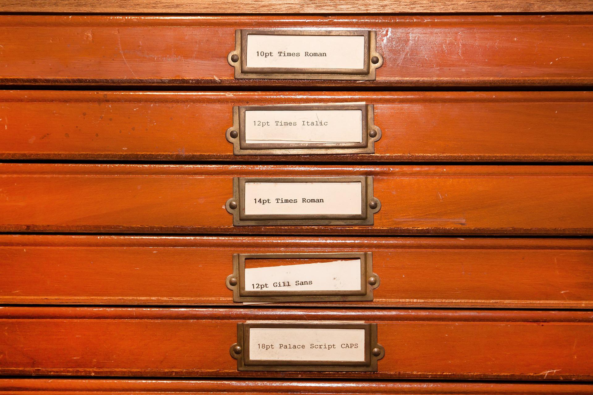
Image by donations welcome from Pixabay